Obsqura Zone provides solutions for those looking for a career in Software Testing. In the crowded niche of online training platforms, making your brand stand out for such a tech-savvy audience requires a robust, memorable, and SEO-friendly website.
Obsqura Zone is one of the leading software testing training institutes operating in India, UAE, Australia, and The UK. They are a team of veterans providing online and offline training in test automation for both freshers and working professionals. They offer customized training solutions and certifications to clients globally. They also provide tailor-made corporate training on emerging and in-demand technologies. With 24*7 assistance, Obsqura Zone is keen on helping its students make the right career advancements and achieve better career growth.
Strategy
Design
Development
WordPress

Our first step was to identify what compelled conversions in this niche. What was that one little thing that compelled visitors want to become customers? To understand this, we conducted extensive research and user interviews. We discovered that customer’s cared most about getting placed in a good company as indicative of successful course completion. This was quite fortunate because Obsqura Zone excelled at this!
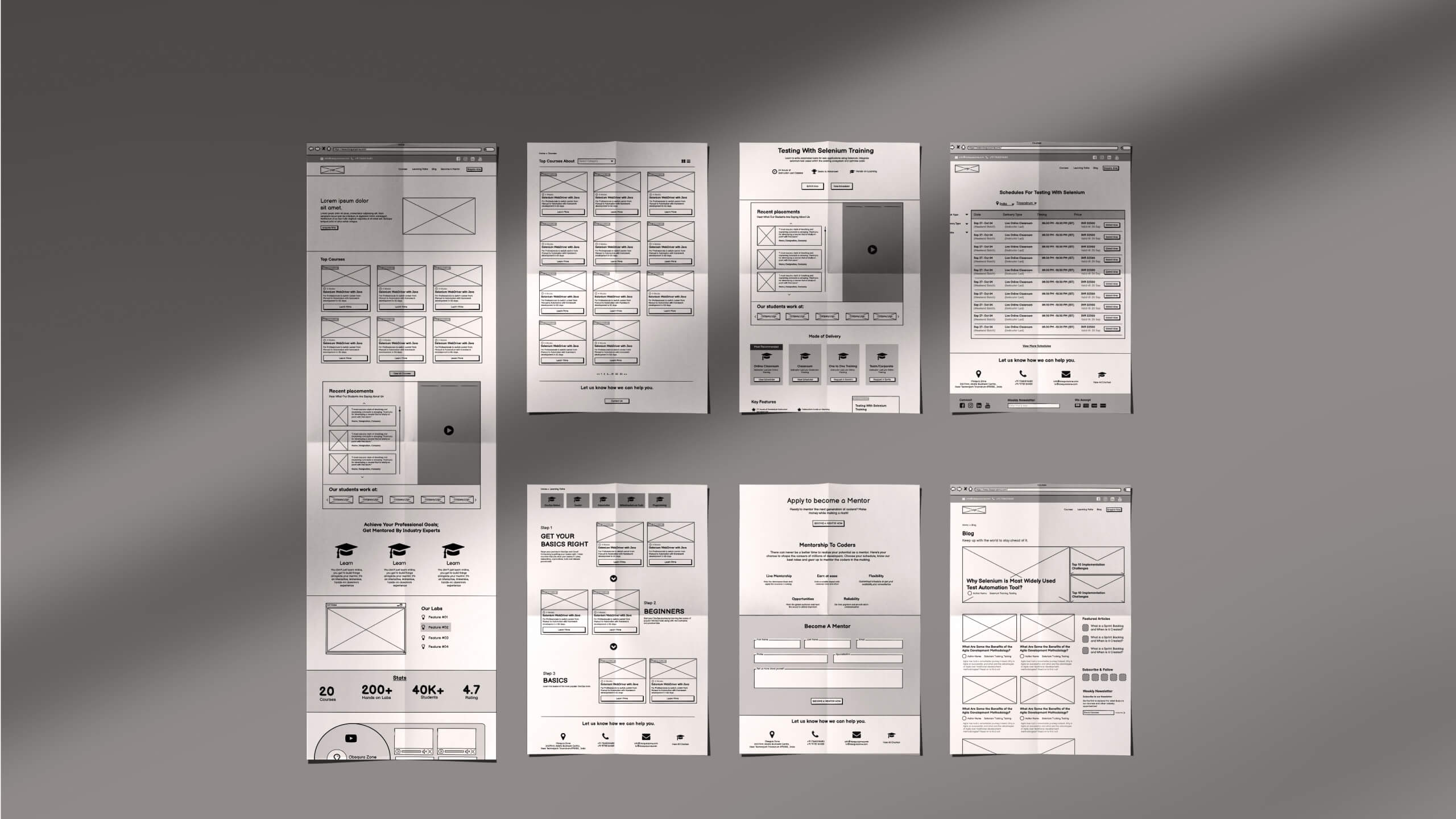
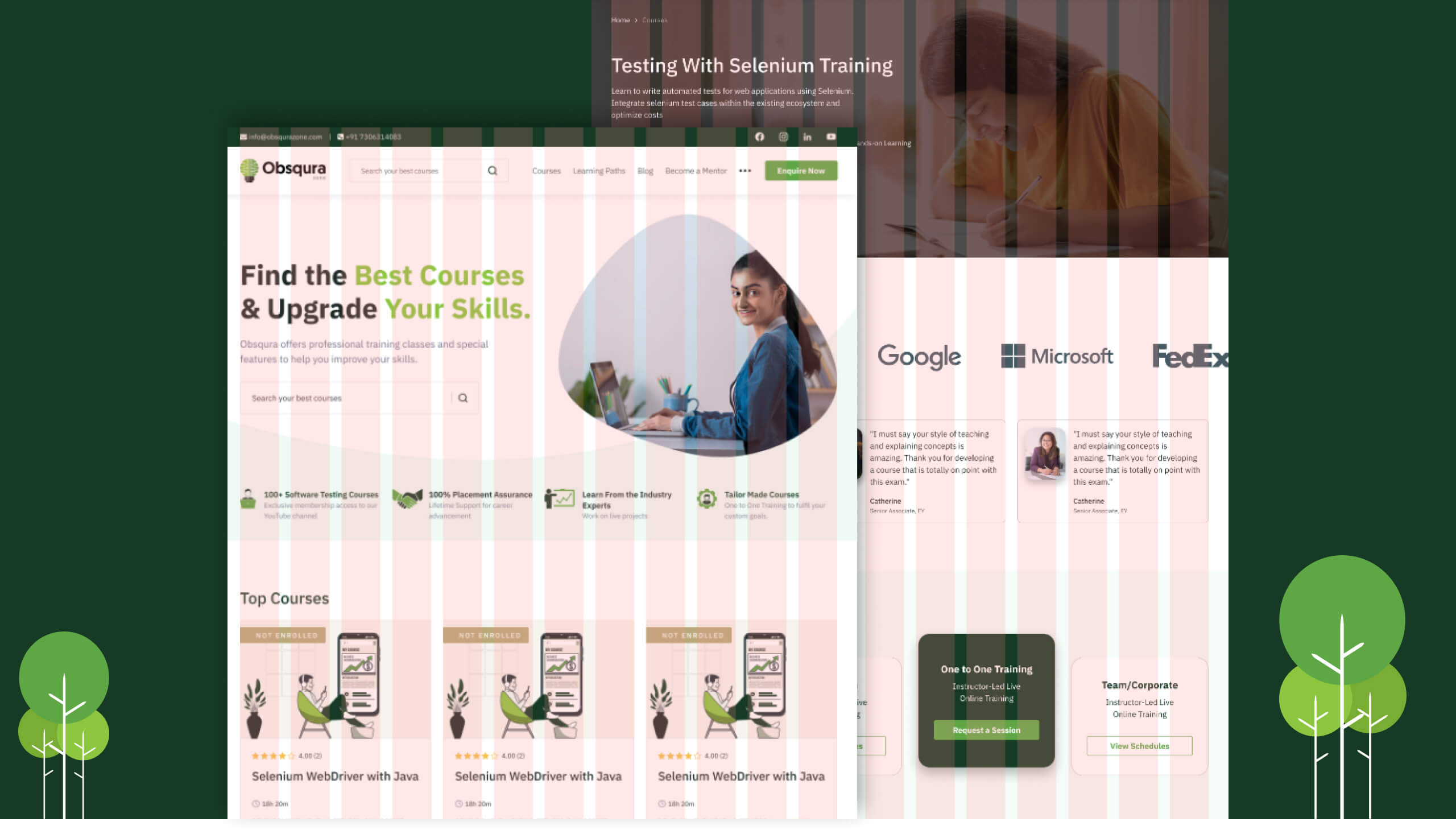
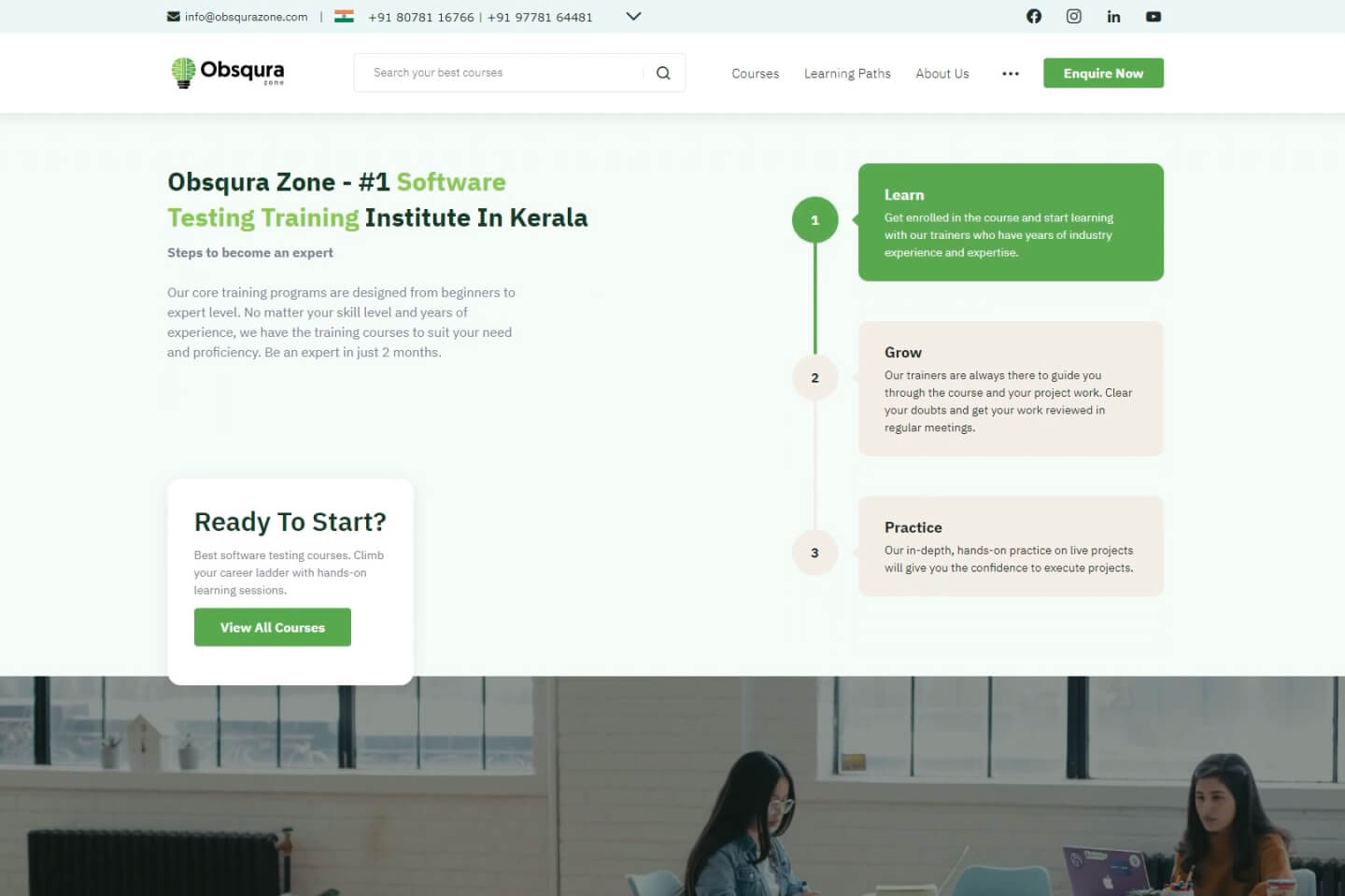
We just needed an effective way of communicating this on the website. We redesigned their homepage to bring more attention to this aspect, which added tremendous value to their business, and included the following components:
The following are the other areas where we made significant changes to their existing structure.
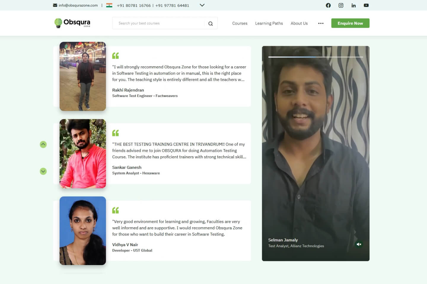
Video testimonials and recent placements are presented in an interactive section. The testimonials are in a 9:16 aspect ratio. In our Ux surveys, we discovered that this format delivered the best engagement ratio with our target demographic. This design element was chosen to give the users a similar feel to using IG stories or reels. The recent placements are shown on the left side as a vertical slider. It has the client’s image, name, designation, and also their testimonial in words and thus nailing the brief on social proof!
Obsqura Zone has students learning from India, The UAE, The UK, and Australia. The phone number, course pricing, schedules, etc. will change automatically based on the user’s location. While still allowing them to choose a different country if they want to.
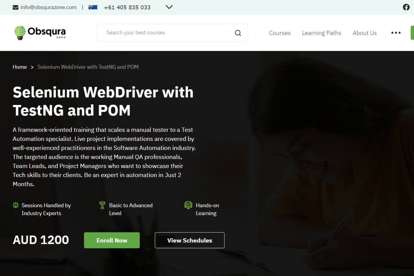
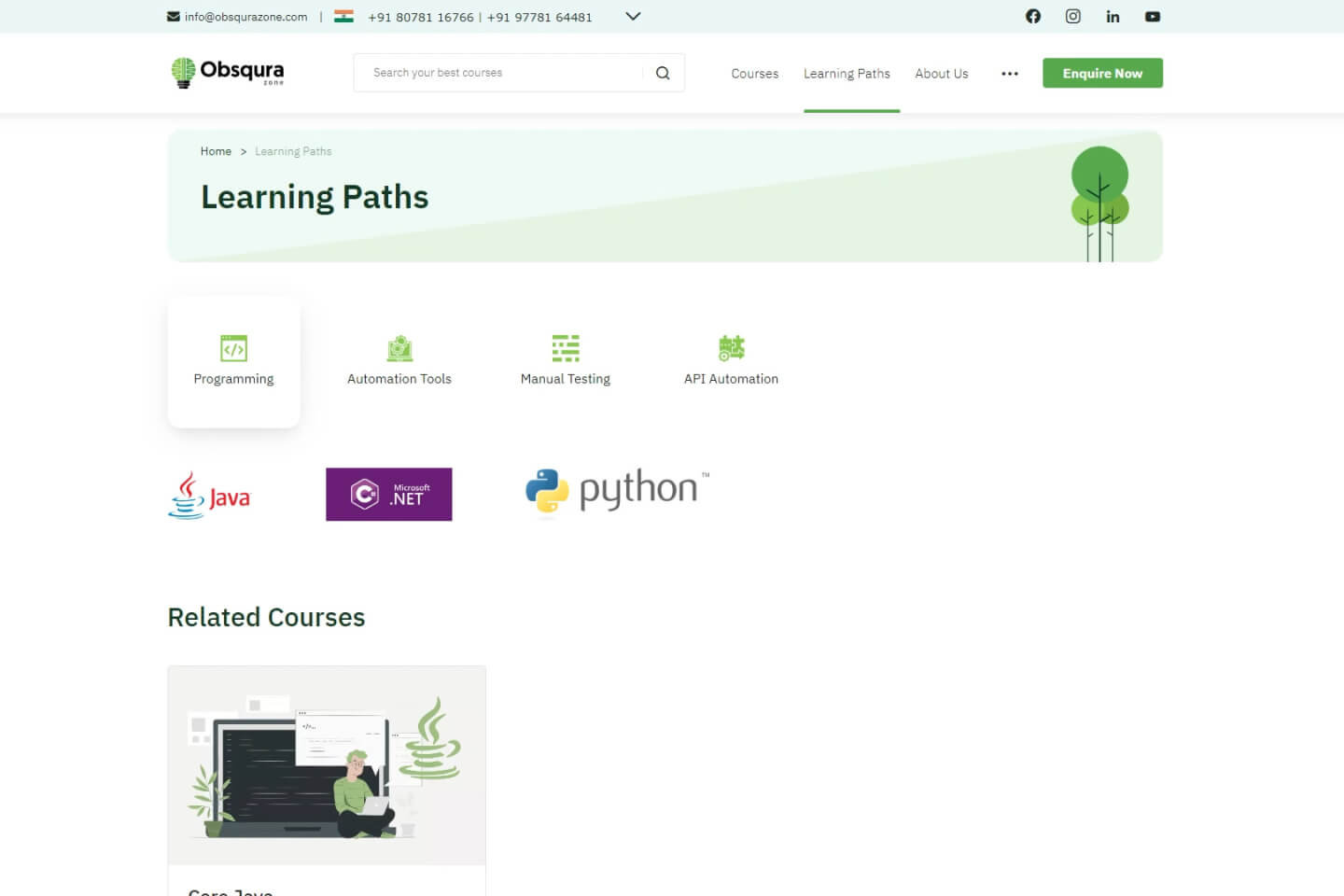
A dynamic list that helps users to find courses based on the technology or software they are looking to learn. Selecting a particular technology will automatically show the course related to it and the software they will be learning in that particular course.
The different tabs and scrolls throughout the website are eye-catching and interactive. Though each one has its own purpose, our design thinking is for it to create a general theme throughout the website.
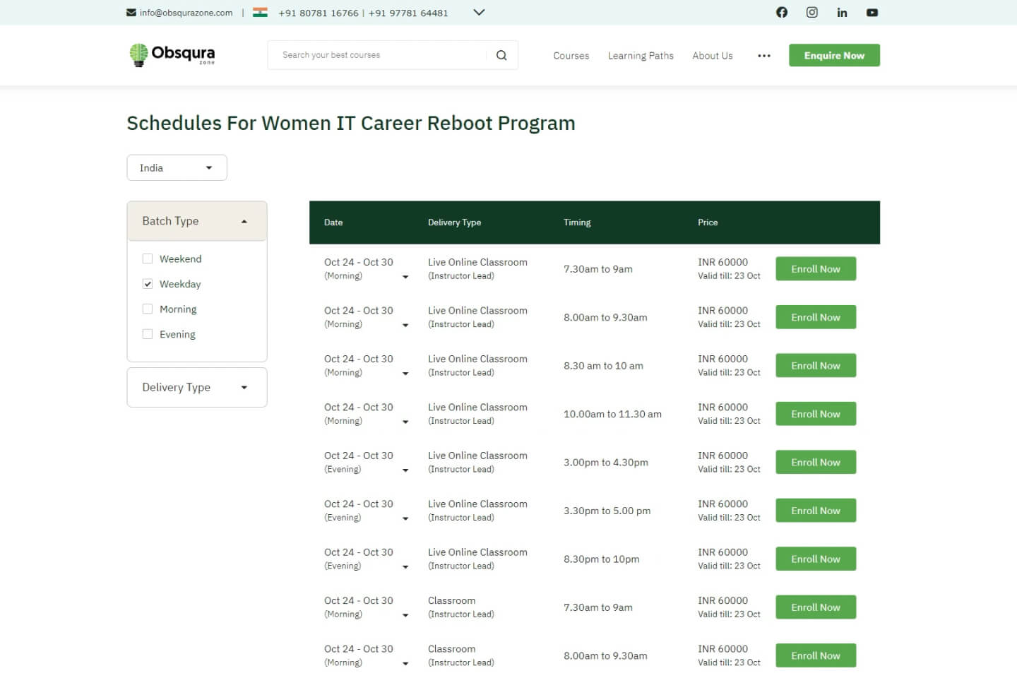
Schedules and modes of delivery of each course are presented in a simple and easy-to-understand interface. They can be filtered according to the day or the different modes of delivery.